Slideshow Carousel
Overview
The carousel plugin can function as a rotating content widget, a slideshow, or a filmstrip gallery. It's fully responsive, can use images or HTML, and slides can even be loaded via AJAX. There are 7 different slide transitions and there are multiple styles for controls.
Usage
Each carousel has at minimum a container with a class of either carousel or
carouselClean and an unordered list of slides with the class of
slides. The starting slide li should be given a class of
active.
Various options controlling the type and duration of transitions for each carousel can be passed in by setting data attributes in the container element.
Slide content can include anything that you would like, including HTML, images, videos, AJAX content, or even external websites. Image-based slides can also have captions and thumbnail previews.
Multiple carousel control variations are possible, which will allow you to make each carousel unique, giving as much control to the user as you'd like.
Minimal Demo
Code
<div class="carousel">
	<ul class="slides">
		<li class="active"><h3>Slide 1</h3></li>
		<li><h3>Slide 2</h3></li>
		<li><h3>Slide 3</h3></li>
		<li><h3>Slide 4</h3></li>
	</ul>
</div>
Carousel Options
The carousel options are data attributes that should be applied to the carousel container element
with the carousel class.
| Option | Description | Default | Values |
|---|---|---|---|
data-autoplay |
Whether or not the slides automatically play. | true | true | false |
data-duration |
The delay in milli-seconds between each slide change. | 4000 | integer |
data-transition |
The type of transition between slides. Note that the zoomPan option will only work for image based slideshows. | standard | standard | fade | slideLeft | slideRight | slideTop | slideBottom | zoomPan |
Slide Options
The slide options are data attributes that should be applied to the slide li container
element.
| Option | Description | Default | Values |
|---|---|---|---|
data-targetUrl |
The URL with which the slide's content should be populated. Any current slide content will be replaced with the AJAX content. | none | relative URL (no iframe) | full URL (iframe) |
Carousel Controls
There are multiple ways to control the carousel with standard controls like play, pause, next, previous, first and last. There is also a counter element that keeps track of the current slide number.
All of the controls are optional. If you don't want the user to be able to control the
carousel, you can omit all controls. Note Clicking on any
of the controls or slide navigation will automatically stop autoplay if it is currently
enabled. The only way for autoplay to be re-initiated is to include the play
control.
| Control Class | Description |
|---|---|
next |
Advances the carousel to the next slide. |
previous |
Reverses the carousel to the previous slide. |
play |
Initiates autoplay. If autoplay is already enabled,
it will automatically change to pause. |
pause |
Stops autoplay. If autoplay is not enabled, it will
automatically change to play. |
first |
Sets the carousel to the first slide. |
last |
Sets the carousel to the last slide. |
counter |
Displays the current slide number in relation to the number of slides. |
Placing Controls
There are three configuration options for placing the controls within the carousel container. The simplest configuration method uses only the next and previous controls. In this case, the controls will be placed at either side of the carousel (see the demo). In this case, the controls do not need to be wrapped in a list; they can simply be inserted into the container element.
The remaining types of control configurations need to be wrapped in an unordered list. The
next controls type simply applies a class of controls to the list. In this
setup, the controls appear below the carousel slides in the lower-right corner of the
carousel container (demo).
The final control type is also wrapped in a list like above, but with a class of
controlsTop. This configuration will appear in the upper right, overlayed on
top of the slide (demo). It will be semi-transparent by default,
but will become fully opaque when hovered over. Note The
transparency will need to be adjusted if heavy mobile or touchscreen usage is expected as
there is no hover equivalent for those devices.
Next/Previous Only
<div class="carousel">
	<ul class="slides">
		<!-- Slides would go here -->
	</ul>
	<a href="#" class="previous" title="Previous"><i class="iconChevronLeft"></i></a>
	<a href="#" class="next" title="Next"><i class="iconChevronRight"></i></a>
</div>
Control Lists
<div class="carousel">
	<ul class="slides">
		<!-- Slides would go here -->
	</ul>
	<ul class="controlsTop">
		<li><span class="counter"></span></li>
		<li><a href="#" class="first" title="First"><i class="iconStart"></i></a></li>
		<li><a href="#" class="previous" title="Previous"><i class="iconRewind"></i></a></li>
		<li><a href="#" class="play" title="Play"><i class="iconTriangleRight"></i></a></li>
		<li><a href="#" class="next" title="Next"><i class="iconForward"></i></a></li>
		<li><a href="#" class="last" title="Last"><i class="iconEnd"></i></a></li>
	</ul>
</div>
Slide Previews
The individual slide navigation is contained in an unordered list with a class of
previews. Each li element should contain a link, with the
starting preview link having a class of active. The slide navigation will
always appear beneath the slides, but within the carousel container element. Clicking on a
preview link will stop autoplay.
The slide previews can contain text (demo), images (demo), or even be empty (demo).
If thumbnails are used, add the class thumbs to the preview list. The carousel
will automatically add a slider if necessary depending on the width of the carousel and the
number and size of the thumbnails. The active thumbnail is fully opaque while non-active
thumbnails will be slightly transparent.
If you prefer to leave the preview links empty, add an empty class to the
preview list and the links will appear as circles.
Numerical Previews
<div class="carousel">
	<ul class="slides">
		<!-- Slides would go here -->
	</ul>
	<ul class="previews">
		<li><a href="#" class="active">1</a></li>
		<li><a href="#">2</a></li>
		<li><a href="#">3</a></li>
		<li><a href="#">4</a></li>
	</ul>
</div>
Thumbnail Previews
<div class="carousel">
	<ul class="slides">
		<!-- Slides would go here -->
	</ul>
	<ul class="previews thumbs">
		<li><a href="#" class="active"><img src="thumb1.jpg"/></a></li>
		<li><a href="#"><img src="thumb2.jpg"/></a></li>
		<li><a href="#"><img src="thumb3.jpg"/></a></li>
		<li><a href="#"><img src="thumb4.jpg"/></a></li>
	</ul>
</div>
Slide Captions
For image-based slides, interactive HTML captions can be added after the image using a
div element with a class of caption. The caption can contain
links, images, or whatever content you would like to include.
By default, captions are hidden and appear when the slide is hovered over. However, in some
cases, you may want the captions to be visibile by default. To make captions always visible,
add a persist class to the caption container.
<div class="carousel">
	<ul class="slides">
		<li class="active">
			<img src="slide1.jpg"/>
			<div class="caption persist">This caption will always be visible.</div>
		</li>
		<li class="active">
			<img src="slide2.jpg"/>
			<div class="caption">This caption will appear on hover.</div>
		</li>
	</ul>
</div>
Demos


Standard Carousel w/ Captions
A standard carousel with text-based slide previews, persistent captions, and a minimal control set. It also has a custom slide duration of 5 seconds.
<div class="carousel" data-autoplay="true" data-duration="5000">
	<ul class="slides">
		<li class="active">
			<img src="../images/slides/paris-1.jpg"/>
			<div class="caption persist">A church near Sacre Couer, in Paris, France.</div>
		</li>
		<li>
			<img src="../images/slides/paris-2.jpg"/>
			<div class="caption persist">Sacre Couer in Paris, France.</div>
		</li>
		<li>
			<img src="../images/slides/paris-3.jpg"/>
			<div class="caption persist">The Eiffel Tower in Paris, France.</div>
		</li>
		<li>
			<img src="../images/slides/paris-4.jpg"/>
			<div class="caption persist">Notre Dame in Paris, France.</div>
		</li>
	</ul>
	<ul class="controls">
		<li><a href="#" class="previous" title="Previous"><i class="iconRewind"></i></a></li>
		<li><a href="#" class="play" title="Play"><i class="iconTriangleRight"></i></a></li>
		<li><a href="#" class="next" title="Next"><i class="iconForward"></i></a></li>
	</ul>
	<ul class="previews">
		<li><a href="#" class="active">1</a></li>
		<li><a href="#">2</a></li>
		<li><a href="#">3</a></li>
		<li><a href="#">4</a></li>
	</ul>
</div>
Manual Fade Slideshow
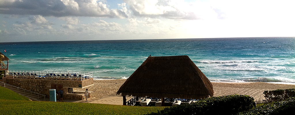
A minimal carousel with a fade transition, no previews, hover captions, and next and previous buttons. Autoplay has been disabled.


<div class="carousel" data-autoplay="false" data-transition="fade">
	<ul class="slides">
		<li class="active">
			<img src="../images/slides/mexico-1.jpg"/>
			<div class="caption">Sunset at Cancun, Mexico.</div>
		</li>
		<li>
			<img src="../images/slides/mexico-2.jpg"/>
			<div class="caption">Mayan ruins near Cancun, Mexico.</div>
		</li>
		<li>
			<img src="../images/slides/mexico-3.jpg"/>
			<div class="caption">The beach at Cancun, Mexico.</div>
		</li>
		<li>
			<img src="../images/slides/mexico-4.jpg"/>
			<div class="caption">Resort in Cancun, Mexico.</div>
		</li>
	</ul>
	<a href="#" class="previous" title="Previous"><i class="iconChevronLeft"></i></a>
	<a href="#" class="next" title="Next"><i class="iconChevronRight"></i></a>
</div>
AJAX Carousel
This carousel illustrates how to load AJAX content (slide 4) and how non-image-based HTML content can be used. Autoplay has been disabled.
<div class="carousel" data-autoplay="false">
	<ul class="slides">
		<li class="active">
			<h3>Slide 1</h3>
			<p>This is a normal slide.</p>
		</li>
		<li>
			<h3>Slide 2</h3>
			<p>This is a normal slide.</p>
		</li>
		<li>
			<h3>Slide 3</h3>
			<p>This is a normal slide.</p>
		</li>
		<li data-targetUrl="../AJAX/slide.html">
			<h3>Slide 4</h3>
		</li>
	</ul>
	<ul class="previews">
		<li><a href="#" class="active">1</a></li>
		<li><a href="#">2</a></li>
		<li><a href="#">3</a></li>
		<li><a href="#">4</a></li>
	</ul>
	<ul class="controls">
		<li><a href="#" class="previous" title="Previous"><i class="iconRewind"></i></a></li>
		<li><a href="#" class="play" title="Play"><i class="iconTriangleRight"></i></a></li>
		<li><a href="#" class="next" title="Next"><i class="iconForward"></i></a></li>
	</ul>
</div>
Thumb Gallery
This version of the carousel has thumbnail previews in a filmstrip form, as well as the
top-right control bar with all controls and a counter. When the browser is resized, a slider
for the thumbnails automatically appears when needed. The transition is
slideLeft, but notice that it reverses itself if the previous button is
clicked.
-
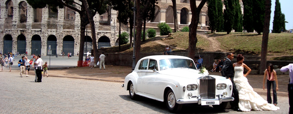 A bride poses outside the Coloseum in Rome, Italy.
 -
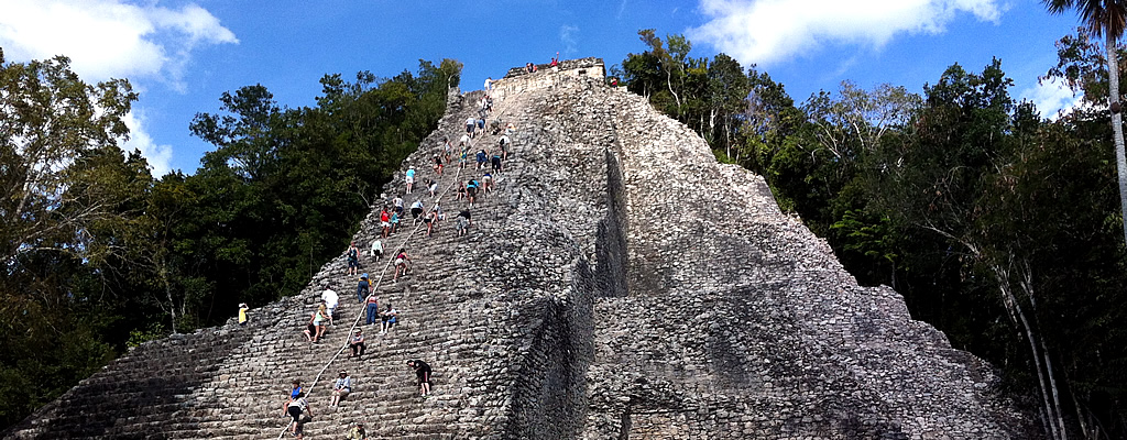
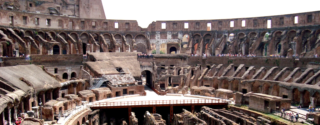 The inside of the Coloseum in Rome, Italy.
 -
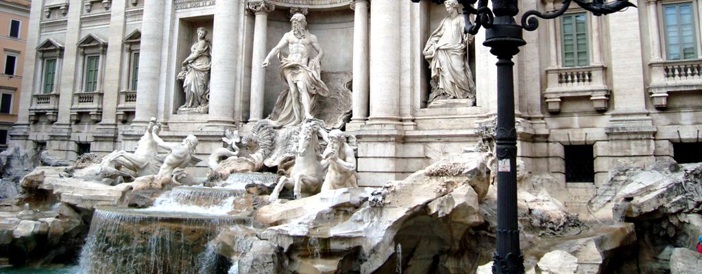 The Trevi Fountain in Rome, Italy.
 -
 A Vatican sculpture in Rome, Italy.
 -
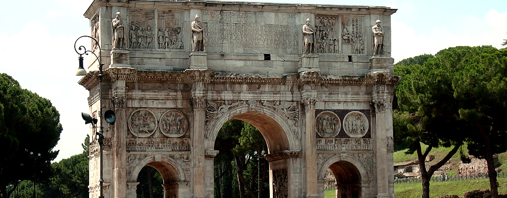 The Arch of Constantine in Rome, Italy.
 -
 A view of the Tomb of the Unknown Solider in Rome, Italy.
 -
 A view of the Coloseum in Rome, Italy.
 -
 A courtyard in Rome, Italy.
 -
 St. Peter's Basilica in Rome, Italy.
 -
 A roman villa in Rome, Italy.


<div class="carousel" data-autoplay="true" data-duration="5000" data-transition="slideLeft">
	<ul class="slides">
		<li class="active">
			<img src="../images/slides/rome-1.jpg"/>
			<div class="caption">A bride poses outside the Coloseum in Rome, Italy.</div>
		</li>
		<li>
			<img src="../images/slides/rome-2.jpg"/>
			<div class="caption">The inside of the Coloseum in Rome, Italy.</div>
		</li>
		<li>
			<img src="../images/slides/rome-3.jpg"/>
			<div class="caption">The Trevi Fountain in Rome, Italy.</div>
		</li>
		<li>
			<img src="../images/slides/rome-4.jpg"/>
			<div class="caption">A Vatican sculpture in Rome, Italy.</div>
		</li>
		<li>
			<img src="../images/slides/rome-5.jpg"/>
			<div class="caption">The Arch of Constantine in Rome, Italy.</div>
		</li>
		<li id="slide6">
			<img src="../images/slides/rome-6.jpg"/>
			<div class="caption">A view of the Tomb of the Unknown Solider in Rome, Italy.</div>
		</li>
		<li>
			<img src="../images/slides/rome-7.jpg"/>
			<div class="caption">A view of the Coloseum in Rome, Italy.</div>
		</li>
		<li>
			<img src="../images/slides/rome-8.jpg"/>
			<div class="caption">A courtyard in Rome, Italy.</div>
		</li>
		<li>
			<img src="../images/slides/rome-9.jpg"/>
			<div class="caption">St. Peter's Basilica in Rome, Italy.</div>
		</li>
		<li>
			<img src="../images/slides/rome-10.jpg"/>
			<div class="caption">A roman villa in Rome, Italy.</div>
		</li>
	</ul>
	<ul class="controlsTop">
		<li><span class="counter"></span></li>
		<li><a href="#" class="first" title="First"><i class="iconStart"></i></a></li>
		<li><a href="#" class="previous" title="Previous"><i class="iconRewind"></i></a></li>
		<li><a href="#" class="play" title="Play"><i class="iconTriangleRight"></i></a></li>
		<li><a href="#" class="next" title="Next"><i class="iconForward"></i></a></li>
		<li><a href="#" class="last" title="Last"><i class="iconEnd"></i></a></li>
	</ul>
	<ul class="previews thumbs">
		<li><a href="#" class="active"><img src="../images/slides/rome-1-thumb.jpg"/></a></li>
		<li><a href="#"><img src="../images/slides/rome-2-thumb.jpg"/></a></li>
		<li><a href="#"><img src="../images/slides/rome-3-thumb.jpg"/></a></li>
		<li><a href="#"><img src="../images/slides/rome-4-thumb.jpg"/></a></li>
		<li><a href="#"><img src="../images/slides/rome-5-thumb.jpg"/></a></li>
		<li><a href="#"><img src="../images/slides/rome-6-thumb.jpg"/></a></li>
		<li><a href="#"><img src="../images/slides/rome-7-thumb.jpg"/></a></li>
		<li><a href="#"><img src="../images/slides/rome-8-thumb.jpg"/></a></li>
		<li><a href="#"><img src="../images/slides/rome-9-thumb.jpg"/></a></li>
		<li><a href="#"><img src="../images/slides/rome-10-thumb.jpg"/></a></li>
	</ul>
</div>
-
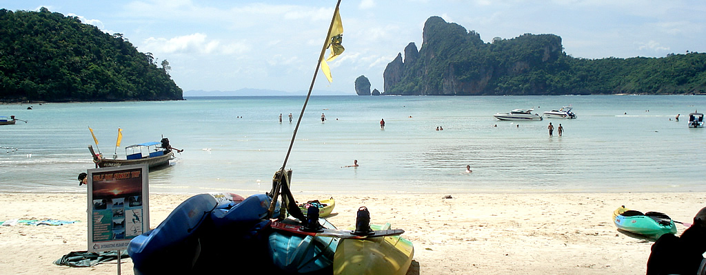
 A private beach in Phuket, Thailand.
 -
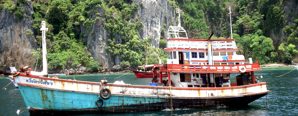 A fishing boat off the coast of Phuket, Thailand.
 -
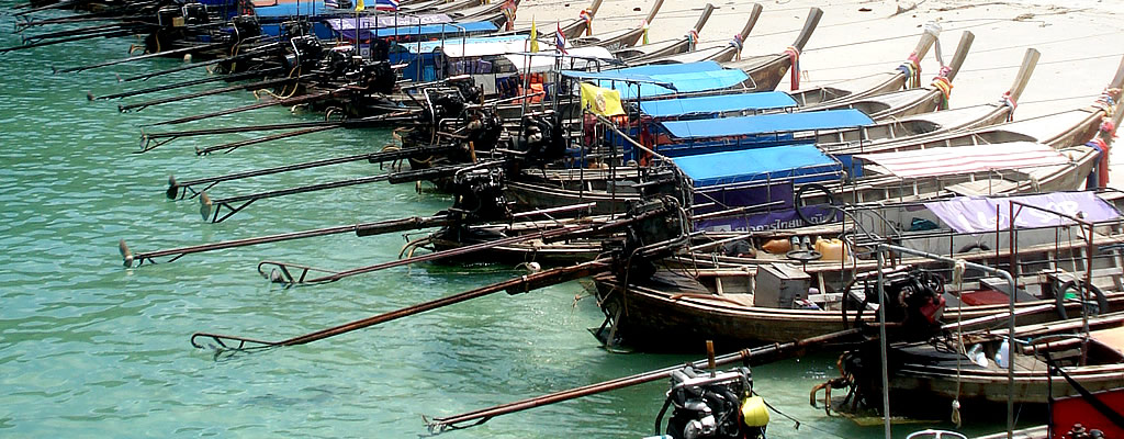 Water taxis lined up on shore at Koh Pi Pi Leh, Thailand.
 -
 The beach at Koh Pi Pi Leh, Thailand.
Zoom & Pan Slideshow
This carousel example is a true slideshow, with autoplay and no controls. It features
the zoomPan transition, which is excellent for adding emotion and dramatic
qualities for images. This transition will only work with images and captions, but not with
other HTML content.
Note In Opera, the Zoom & Pan Slideshow will revert to the Standard transition due to technical issues.
<div class="carousel" data-transition="zoomPan" data-duration="5000">
	<ul class="slides">
		<li class="active">
			<img src="../images/slides/thailand-1.jpg"/>
			<div class="caption">A private beach in Phuket, Thailand.</div>
		</li>
		<li>
			<img src="../images/slides/thailand-2.jpg"/>
			<div class="caption">A fishing boat off the coast of Phuket, Thailand.</div>
		</li>
		<li>
			<img src="../images/slides/thailand-3.jpg"/>
			<div class="caption">Water taxis lined up on shore at Koh Pi Pi Leh, Thailand.</div>
		</li>
		<li>
			<img src="../images/slides/thailand-4.jpg"/>
			<div class="caption">The beach at Koh Pi Pi Leh, Thailand.</div>
		</li>
	</ul>
</div>
Clean Carousel
The clean carousel is meant for when borders and background colors are undesired and simply
uses a carouselClean class in place of carousel. This example
also features the empty style of the preview links.
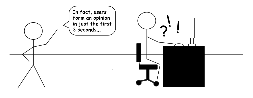
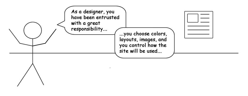
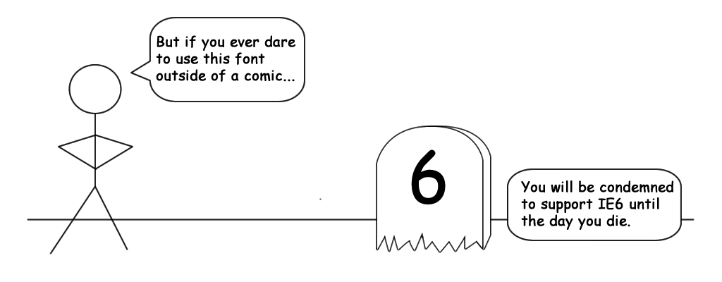
<div class="carouselClean" data-duration="5000">
	<ul class="slides">
		<li class="active"><img src="../images/slides/comic-1.png"/></li>
		<li><img src="../images/slides/comic-2.png"/></li>
		<li><img src="../images/slides/comic-3.png"/></li>
		<li><img src="../images/slides/comic-4.png"/></li>
	</ul>
	<ul class="previews empty">
		<li><a href="#" class="active"></a></li>
		<li><a href="#"></a></li>
		<li><a href="#"></a></li>
		<li><a href="#"></a></li>
	</ul>
</div>
Want to continue the tour?
- Quick Links:
- Website
- GitHub
- Report an issue
- Return to top
VM UI Framework is created, owned, maintained by Virtuosi Media, Inc. © 2012-2013.